
Koto has partnered with Tripadvisor on a comprehensive brand refresh. As the platform expands its role from a travel review site to a broader platform for planning and booking, the new identity reflects the company’s evolving direction.
![]()
Founded 25 years ago, Tripadvisor helped shift the travel landscape by emphasizing real reviews from real people. With recent additions like AI-powered planning tools and direct booking features, the brand update aims to support a wider set of services, TripAdvisor needed a brand identity to match its ambition.
“As Tripadvisor is entering a new chapter of its growth, the brand had to meet that moment,” said Arthur Foliard, Executive Creative Director at Koto.
“That meant putting the heart of Tripadvisor — its global community of travelers — front and center. We built the entire strategy and identity around real people: their words, their photos, their stories. With over a billion reviews and counting, Tripadvisor isn’t just a platform for travel — it’s built by travelers, for travelers.
This rebrand captures that energy, that curiosity, and that wisdom you can only get from people who’ve been there.

Brand Strategy: Built Around Real Travel, Real People
The rebrand began with Tripadvisor’s most powerful asset: a community of real travelers sharing real experiences. In a world of algorithmic recommendations, that human voice became the foundation.
From this foundation, Koto grounded the strategy in two essential truths: people want advice from travelers who reflect their values and experiences, and the richness of those stories helps them picture what a trip might feel like.
As Tripadvisor is entering a new chapter of its growth, the brand had to meet that moment.
Koto developed a verbal identity to match: Tripadvisor’s voice is now warmer, more relatable, and made to connect. It flexes across brand and product without losing character. The system defines how the brand speaks alongside traveler reviews, balancing editorial clarity with community wisdom.
A Design System That Feels Lived-In
Tripadvisor’s new identity is built to showcase travel as it really is: personal, textured, and emotional. Every element was designed to elevate real stories, without feeling staged or slick.
The logo brings new life to Tripadvisor’s iconic owl mascot, Ollie. Once static and ornamental, Ollie now feels expressive, his gaze always oriented toward traveler content, a quiet cue that Tripadvisor values their perspective.
Green color, originally inspired by “green means go,” has been refined to feel warmer and more vibrant. Trip Pine replaces black to add depth and reassurance, while Trip White enhances clarity. The secondary palette is drawn directly from traveler photos to make every layout feel grounded, personal, and real.
Typography is led by Trip Sans, a custom typeface inspired by Tripadvisor’s iconic bubble rating system. Its circular geometry adds consistency and warmth, balancing product clarity with brand expression. It’s built to scale, from interface to campaign.

Graphic devices elevate traveler voices: review bubbles, rounded corners, green dots, and dividers inspired by vintage postcards. Each element adds structure and softness in equal measure, helping the brand feel both organized and human.

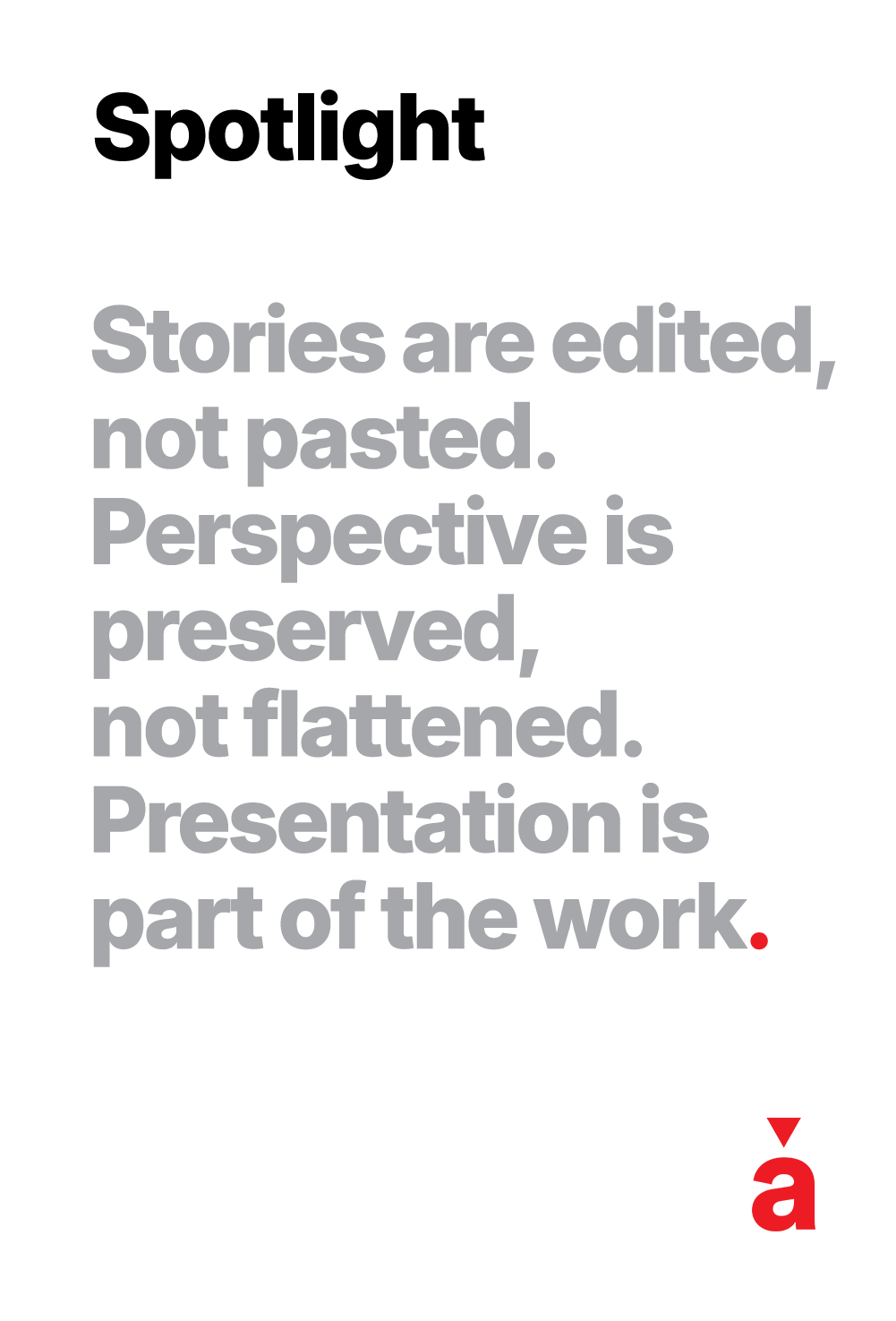
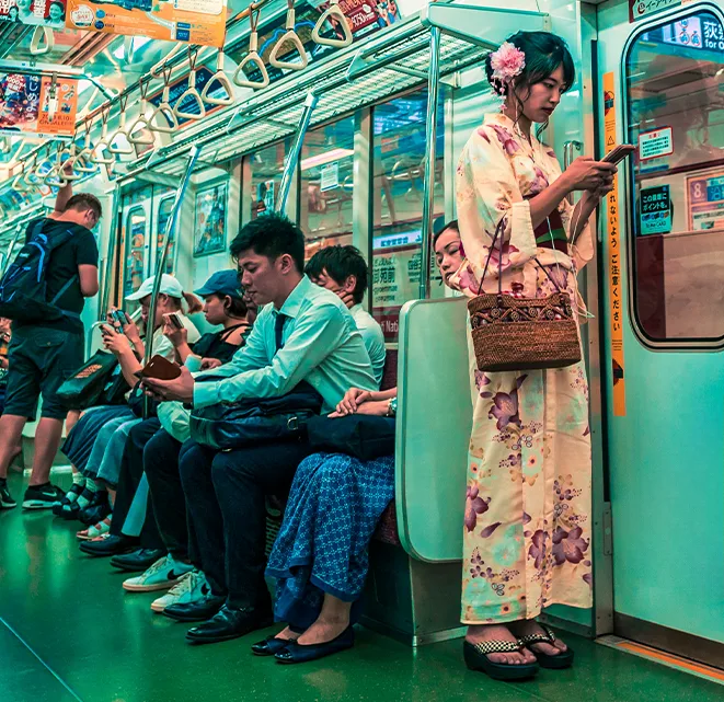
Photography remains Tripadvisor’s emotional core. Sourced exclusively from real users, the imagery is unfiltered, narrative-led, and dynamic. Presets were developed to unify tone and texture, preserving warmth, depth, and a sense of place.
Motion follows the same principle. Ollie’s eyes track content, UI elements glide with intent, and transitions remain smooth and considered.

“As Tripadvisor is entering a new chapter of its growth, the brand had to meet that moment,” said Arthur Foliard, Executive Creative Director at Koto.
“That meant putting the heart of Tripadvisor — its global community of travelers — front and center. We built the entire strategy and identity around real people: their words, their photos, their stories.
“With over a billion reviews and counting, Tripadvisor isn’t just a platform for travel — it’s built by travelers, for travelers. This rebrand captures that energy, that curiosity, and that wisdom you can only get from people who’ve been there.”