
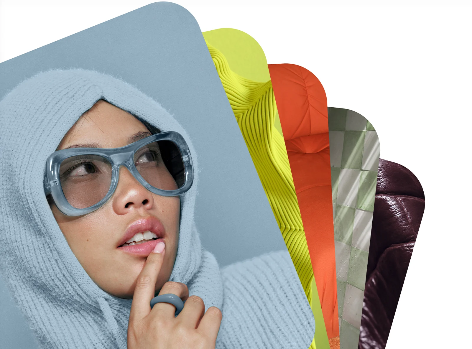
Pinterest has released its 2026 Pinterest Palette, unveiling five trending colors inspired by the platform’s most searched and saved ideas. The annual color drop includes Cool Blue, Jade, Plum Noir, Wasabi, and Persimmon.
These hues are described as bold, bright, and emotionally resonant, reflecting what Pinterest says are the aesthetics shaping creativity and demand across culture in the year ahead. Each color is positioned with distinct emotional associations: Persimmon represents “unfiltered joy,” Wasabi conveys “bold defiance,” and Plum Noir signals “powerful mystery.” Jade is linked to serenity, while Cool Blue evokes “fresh focus.”

“Across the Asia Pacific region, people use Pinterest as their source of inspiration and discovery,” said Ayumi Nakajima, Senior Director, Head of Content Partnerships, APAC at Pinterest.
View this post on Instagram
“This year’s Pinterest Palette reflects how people are becoming more intentional and confident in experimenting with colours – whether that’s in what they wear, how they style their homes, or how they bring personal meaning to milestone moments like weddings or festive celebrations. Pinterest Palette is designed to help people explore these colours in ways that feel relevant, fun, and accessible.”
According to Pinterest, color in 2026 serves as a tool for emotional utility—helping users feel grounded, optimistic, or re-energized amid ongoing noise and chaos.
The platform added in the announcement that people “are ready for colours that do something for them: reset their mood, sharpen their focus or turn the fun back up. People are choosing how they want to feel and how they want to show up, and using colour to express those choices in their everyday lives.”
Pinterest Palette 2026
Pinterest provided the following summary of this year’s colors.
Cool Blue

Meet the shade that’s iced out in the nicest way. This frosty hue of blue adds a stone cold chill to everything it touches. It’s a whole subzero mood that’ll warm you right up.
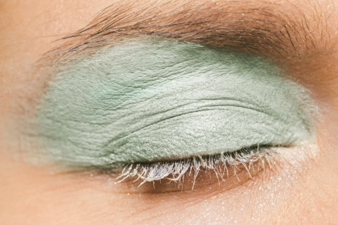
Jade

Move over, pistachio. Jade is the moment. Somewhere between mint and moss, this shade of earthy energy blends serenity and sophisticated elegance. It’s the glamorous green of all your dreamscapes.
Plum Noir

Plum Noir is for the plot. Deep and decadent, this rich, deep purple mixes notes of burnt burgundy with a swirl of velvet brown. Step into your villain era.
Wasabi

Need a jolt? A healthy dose of Wasabi should do the trick. This electric chartreuse brings a vibrant kick to everything from makeup to moodboards this year. It’s high-voltage energy that can’t be tamed.
Persimmon

Sweet, sweet heat. Part orange, part red, Persimmon is the feel-good shade making a splash. This colour is a burst of pure joy.
“For a long time, the safest choice was to keep things quiet and neutral. Now people are ready for more,” said Xanthe Wells, VP of Global Creative at Pinterest.
“Pinterest Palette is an invitation to be a little louder with how you feel—to play, to experiment and to let your world reflect the life you actually want to live.”
See the full report and methodology here.