Brand and digital studio Koto has introduced a refreshed brand identity for Workday (NASDAQ: WDAY), centered around a new strategic positioning: “Inspire a brighter workday for all.”
This updated identity reinforces Workday’s role as a trailblazer in cloud-based enterprise software while positioning the company as a leader in the AI-driven era, with a strong focus on people at the core of its mission.
At the heart of the rebrand is Workday’s distinctive approach to B2B software, combining the precision and seriousness needed to manage critical business operations with a contagious optimism that celebrates work culture in both large and small ways.

A Distinctly Human Approach
Koto’s rebrand highlights Workday’s distinct competitive advantage: personability. Despite its rigorous capacity as a global leader in financial, HR, and business planning solutions, Workday transforms how organizations manage their people and finances with surprising soul. Where making better work means making work better—for everyone.

Workday’s New Dawn: Designing a Future-Forward Identity
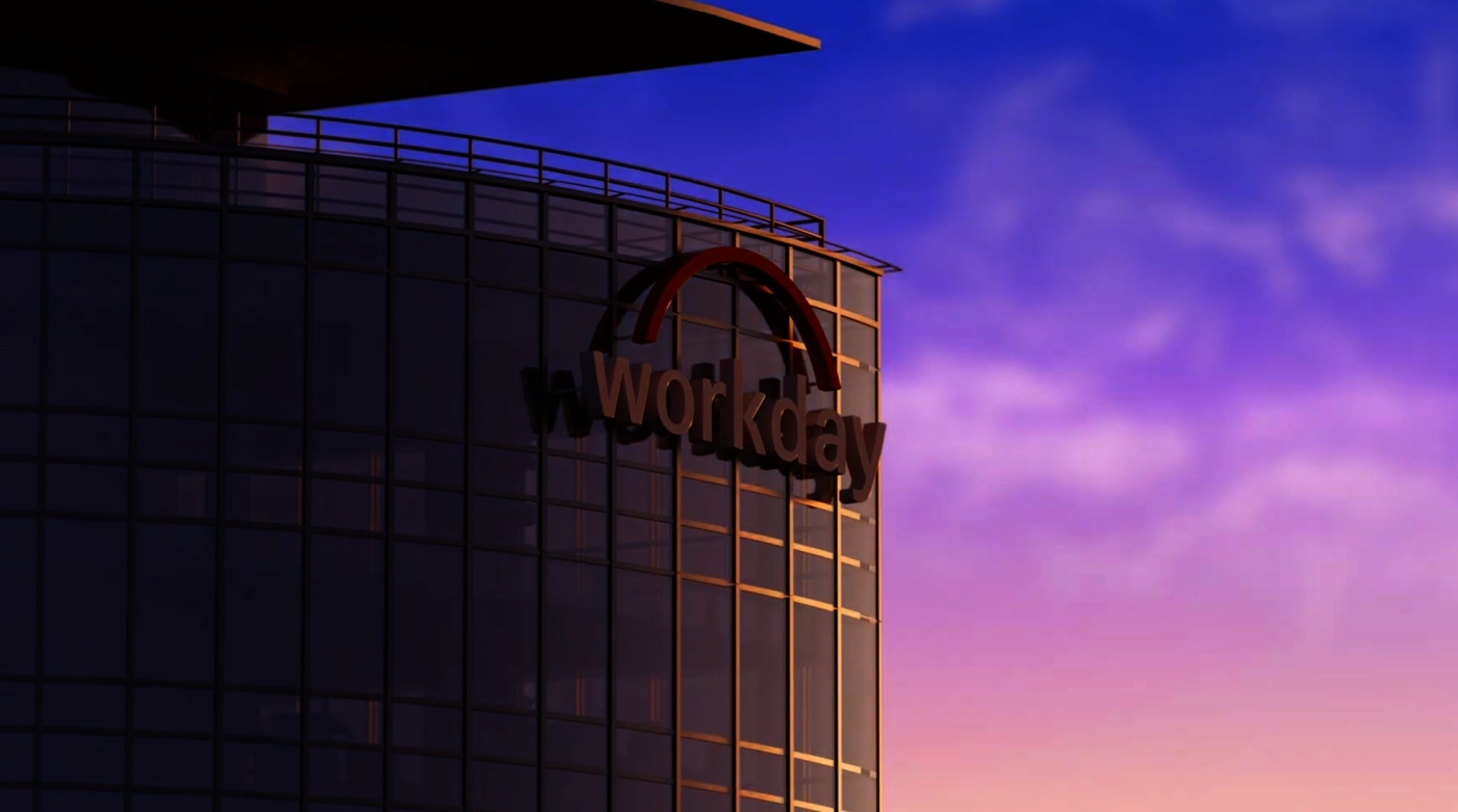
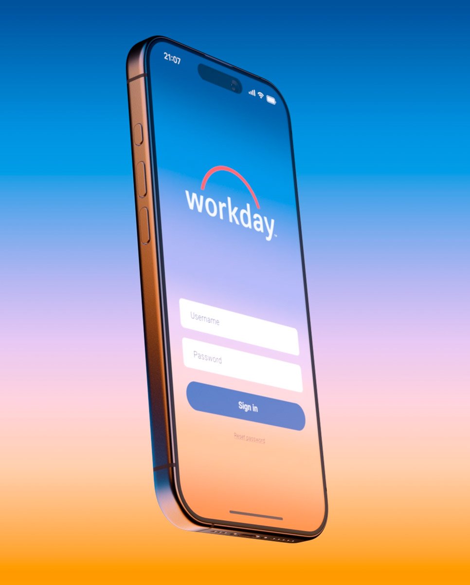
Koto’s refreshed design for the Workday brand captures the company’s essence by blending warmth, humanity, and familiarity. At its core, an evolved logo builds on the company’s longstanding ‘Horizon’ concept, symbolizing optimism and new beginnings.
The updated wordmark features custom letterforms that convey clarity and confidence. The logo family includes a shorthand called ‘The Dub,’ which leverages the wordmark’s leading ‘W’ combined with a compressed horizon for more versatile placements.

Typography plays a key role in the design system, starting with a custom logo font inspired directly by the letterforms in the updated wordmark. The logo font will be supported by Workday Sans, a custom typeface currently in development. It will be built for modernity and sophistication, and feature a variety of weights and cuts to ensure legibility and impact across all communications.
The refreshed color palette is crafted to feel both welcoming and energizing. Warm yellows convey energy and vitality, while cooler blues evoke reflection and an after-hours focus. A secondary palette of vibrant tones and subtle gradients adds depth and flexibility across various touchpoints. Elements, such as arcs, gradients, and a continuous upward movement, reflect the passage of time throughout the day, adding dynamism and warmth to marketing materials, digital interfaces, and more.

Natural light fosters a sense of trust, while depth of field highlights key moments, conveying energy and optimism. Subtle movements in the imagery—such as forward gestures—symbolize progress and embody Workday’s pioneering spirit.

Elements rise and unfold naturally, symbolizing new beginnings and reinforcing Workday’s commitment to innovation and transparency.
![]()
“Working with the Workday team was about more than just building a brand—it was about capturing the heart of their culture and sharing it with the world,” said Caroline Fox, Koto Creative Director.
“Over the past year, we became a true extension of their team, collaborating across brand and digital to ensure every detail felt authentic and resonated with HR and Finance audiences. We’re proud of what we’ve created together and grateful for the trust they placed in us to bring this vision to life.”