An iconic name tracing its roots back to 1935, Jaguar has completely transformed its brand in a move it describes as aiming to “recapture an ethos” rooted in the words of its founder, Sir William Lyons: ‘Copy Nothing.’
The brand’s transformation is guided by the concept of “Exuberant Modernism,” a creative approach influencing all elements of the new Jaguar identity. This philosophy embraces bold, colorful design, aiming to establish a distinctive brand character “that will command attention through fearless creativity.”
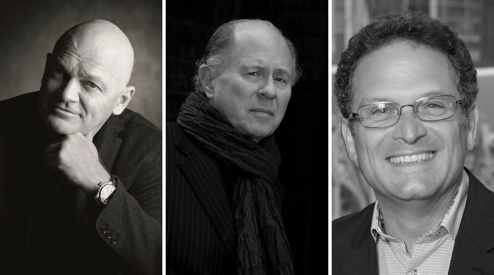
“Jaguar has its roots in originality. Sir William Lyons, our founder, believed that ‘A Jaguar should be a copy of nothing’,” said Professor Gerry McGovern OBE, Chief Creative Officer.
“Our vision for Jaguar today is informed by this philosophy. New Jaguar is a brand built around Exuberant Modernism. It is imaginative, bold, and artistic at every touchpoint. It is unique and fearless.
This is a reimagining that recaptures the essence of Jaguar, returning it to the values that once made it so loved, but making it relevant for a contemporary audience.”
“We are creating Jaguar for the future, restoring its status as a brand that enriches the lives of our clients and the Jaguar community,” McGovern added.
Symbols of Change
The reimagined Jaguar begins its unveiling with a new brand identity, characterized by a bold visual language that “establishes its unique character, through a dramatic new visual language.”
This transformation is symbolized through four key elements, each representing the brand’s core values and offering insights into its future direction.
Jaguar’s new logo is accompanied by vibrant colors and graphic motifs, reflecting its ties to art and creativity. These elements target younger audiences and distinguish the EV lineup from traditional gas-powered vehicles.
Jaguar’s new logo serves as a signature, embodying modernism through geometric shapes, symmetry, and simplicity. The design uniquely merges uppercase and lowercase letters, creating a harmonious and unexpected visual identity.
Strikethrough.
“This bold linear graphic generates an unmistakeable presence and an immediately recognisable visual for Jaguar, striking through imitation and the ordinary,” the brand said in a release.
Exuberant Colours.
Exuberant use of color is a cornerstone of Jaguar’s new brand identity, embedded in its values and its association with art. Primary colors, born from the painter’s palette – yellow, red, and blue – are the tonal building blocks, always presented with texture or movement.


Makers Marks.
Consisting of the newly reimagined Jaguar ‘leaper’ that is our precious mark of provenance, says Jaguar. “Always leaping forward, it is a representation of excellence and hallmark of the brand.”
Copy Nothing
Next month on 3 December, at Miami Art Week, Jaguar will present ‘Copy Nothing’, the first global public installation for its new brand that will celebrate “artistic expression, in all its forms,” and will include a series of curated gallery spaces over two locations featuring new and ground-breaking emerging artists.
“To bring back such a globally renowned brand we had to be fearless. Jaguar was always at its best when challenging convention,” said Rawdon Glover, Managing Director, Jaguar.. That ethos is seen in our new brand identity today and will be further revealed over the coming months.
This is a complete reset. Jaguar is transformed to reclaim its originality and inspire a new generation. I am excited for the world to finally see Jaguar.”


