
A conversation with the Director of Icarus Design on what sets Indian design apart, the role of instinctive decision-making, and the regional nuances that shape the work.

Brand design in India often means looking beyond what’s said aloud. In a culture where people hesitate to speak their mind with guests, superiors, or elders, uncovering preference becomes part of the work.
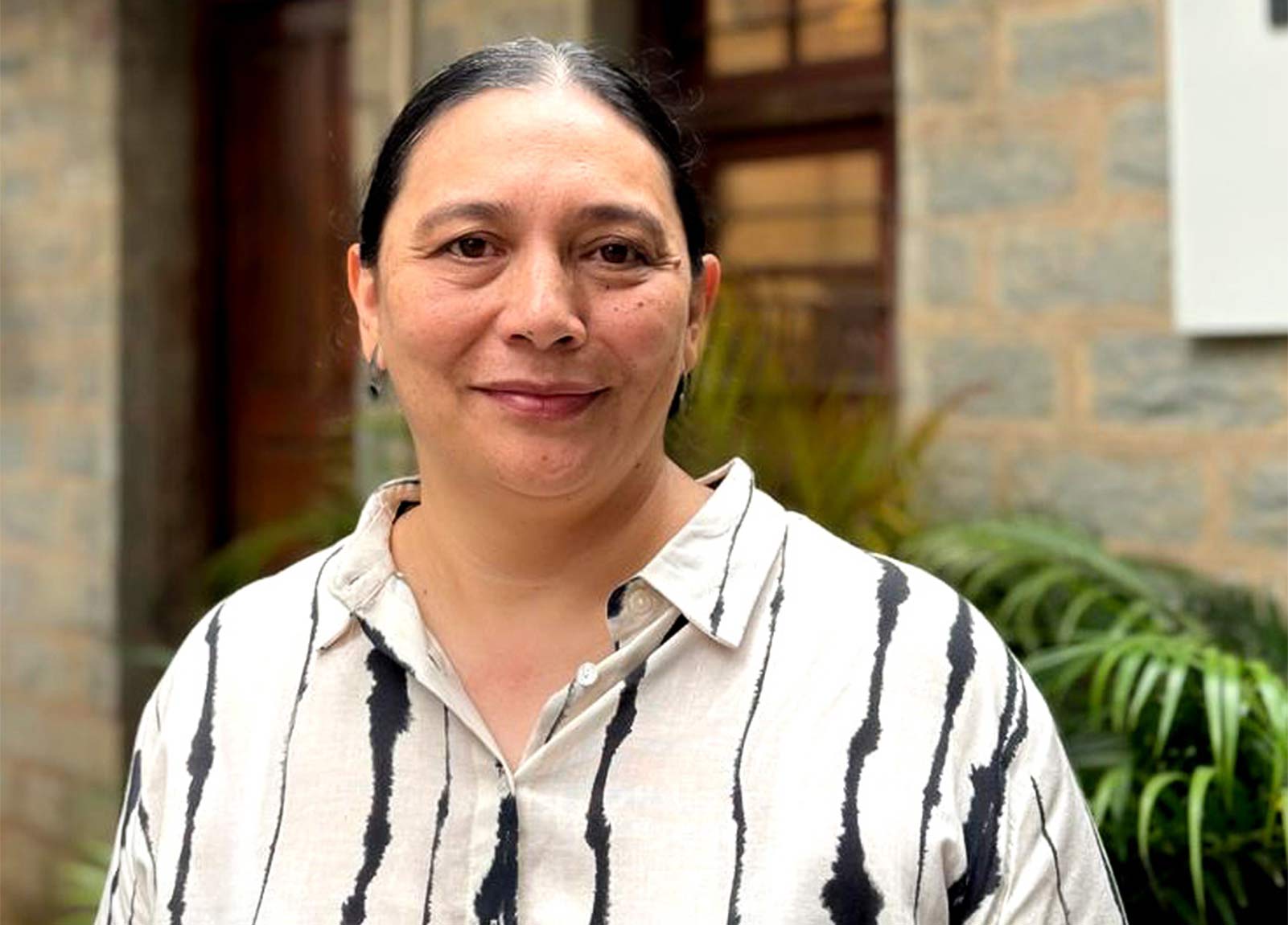
Usha Elizabeth Gergan, Director of Bangalore-based Icarus Design, has built her practice on accessing the instinctive over the articulated. Her approach uses sensorial stimuli to provoke reactions that reveal subconscious preferences — the same method that helped push a legacy brand like Eveready into a new, futuristic visual space, and one that’s essential in a country where visual language shifts dramatically every few hundred kilometers.
As she told us, “That’s why we have to dig deeper into their subconscious preferences. We typically do this by creating highly sensorial stimuli that evoke a future possibility.”
Read on to discover how she uncovers what clients don’t say, why vibrant color and dense visualisation continue to resonate across India, and how her work for brands like Swaadesi and NURA balances cultural authenticity with contemporary restraint.


In terms of visual aesthetics, India isn’t at all homogenous – it’s not one. There is significant regional nuance and variance between urban and rural populations, as well as across regions. This is something that has to be taken into consideration when designing for India.
The average Indian loves the vibrant, and this is reflected across design in most Indian regions.
Broadly, though, the average Indian loves the vibrant, and this is reflected across design in most Indian regions. Unlike other societies, less is not always more. Lack of colour has historically been interpreted as inauspicious or signaling a lack of prosperity, hence the preference for vibrant colour palettes that catch the eye and really ‘pop’. Another characteristic is that in no way are Indians intimidated by dense visualization and ornamentation. We live in busy environments and constantly deal with visuals that globally could be interpreted as “cluttered”.
The muted, clean designs that are now beginning to appear in India are a reflection of globalization and the adoption of visual restraint in what is increasingly becoming a noisy world, as opposed to something intrinsic to Indian design. Our work for Swaadesi had a bit of both – rich, vibrant colours within a clean overall look given that it was positioned as an elevated offering.
On the other hand, for Matta Naad, a new rice brand for the state of Kerala in Southern India, people’s love and pride for their culture and cuisine became the inspiration for a layered and fairly dense composition that simultaneously depicted its rich culture and showcased its traditional feast.
Our design process is driven by consumer preferences that are more instinctive as opposed to being based on rationalisation. And to get at this, we go beyond what’s articulated, because culturally, Indians are people pleasers. We hesitate to speak our mind with guests, superiors and elders for fear of being disrespectful.
This often means that people have learnt not to consciously consider and articulate their preferences. That’s why we have to dig deeper into their subconscious preferences. We typically do this by creating highly sensorial stimuli that evoke a future possibility. People’s gut reactions, even if they are unable to justify their choice, then inform the design work ahead.
Our design process is driven by consumer preferences that are more instinctive as opposed to being based on rationalisation.
This was the only way we were able to push a legacy brand like Eveready into a completely new, futuristic visual space for their alkaline batteries – by getting consumers to react to various avatars of what the brand could possibly look like, and then proving to the client that consumers are willing to accept the brand in a completely different light.
Clients are focused on market success. Their appetite for bold design choices is driven by the modern customer’s willingness to embrace the novel.
We encourage them to embrace innovative designs when we are confident the innovation has genuine resonance with latent consumer needs.
But it is a fine balancing act, gauging the extent of novelty that will be acceptable versus something that will be dismissed. We encourage them to embrace innovative designs when we are confident the innovation has genuine resonance with latent consumer needs. Our work for 1868 by Tata Tea, a brand of luxury teas, is an instance where bold design choices helped push the envelope.
We definitely prefer having clarity around business goals and constraints as these determine what is implementable, which is crucial while arriving at designs.
On the other hand when it comes to the brand aspect, while the context and history is relevant as it is the lens through which a consumer would see any further work, we do prefer the opportunity to gauge for ourselves what the opportunities are, what new insights can be brought to the table from design research, and how those can be used to drive new and innovative designs. To that extent, flexibility of creative freedom is something we look forward to in most projects.
At the school level, there is still not enough emphasis on the creative. However, at the graduate level there has been a huge upsurge in institutions offering design studies in India. This is reflective of the growing need for designers. In terms of the standards of these institutions, though, it’s a bit of a mixed bag.
At the school level, there is still not enough emphasis on the creative. However, at the graduate level there has been a huge upsurge in institutions offering design studies in India.
There is enough and more talent, but only a limited set of institutions that are doing a good job of training young designers for industry.


Pick a role that allows you to acquire real skills, and not just strategy and articulation! As a designer, you need the real ability to evoke a future in whatever medium you are working with. It can’t only be talk!
NURA
Brand & Service Design for an AI Imaging-based Cancer Screening Center
The NURA center leverages FUJIFILM Healthcare’s AI technology to provide safe, accurate and quick screening of the 10 most common cancers and lifestyle diseases in asymptomatic, healthy men and women.
Challenge
Early detection by regular screening plays a vital role in improving cancer survival rates. Unlike Japan, where cancer screening is a norm, in India, cancers are diagnosed at a late stage due to a lack of screening. Fujifilm Healthcare saw India as an opportunity to mark its entry into the health assessment business in emerging economies.
Its ambition was to leverage AI-enabled imaging technology that produced accurate results even at ultra low doses of radiation. This would allow healthy, asymptomatic people to walk in voluntarily and avail periodic screening without a doctor’s prescription.
It partnered with Dr Kutty’s Group, which could bring in the operational expertise. Fujifilm DKH wanted to position this center as a premium brand experience. An entirely new service model was innovated, defined and designed while creating the NURA brand for this new line of business.
Design Intervention
The challenge wasn’t just brand design, but weaving the brand into an experience. Design Research helped us in arriving at the brand position and mapping out the customer journey to orchestrate the service delivery.
The brand was positioned as an addition to a person’s health-sustaining practices like dietary control, exercise regimen and having a positive social life. The service journey was designed to feel quick, transparent and empowering. Digital touchpoints were used strategically to support these journeys and were defined and designed in tandem.
Key business teams, such as the Architects, Technology, Marketing, HR, and Operations, were briefed so as to execute service aspects as per the experience concept.
Response
Beginning with a pilot in Bangalore, Nura has now grown to multiple centres in India, as well as expanded to South Africa, Mongolia, Vietnam, Thailand and will soon be launched in Dubai.
Any shopping street, like Janpath in Delhi or Commercial Street in Bangalore, would be the best place to get a sense of Indian designs. From textiles to jewellery and artifacts, it is symbolic of different aspects of Indian design and culture.
Suresh Eriyat – for his breathtaking animations and their ability to bring Indian stories alive, with all the little nuances that make us unique.
The people and the places – going out, meeting as many people and seeing as many new places is inspiration enough in a country as diverse as India.


To learn more, visit icarus.co.in
All images provided by Icarus Design