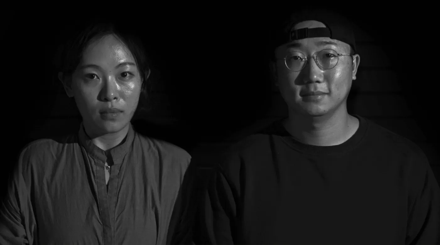


How does a design studio, run by non-koreans, create a minimalist logo that encapsulates centuries of Korean design heritage while simultaneously embodying cutting-edge innovation? Working in partnership with Branding in Asia, our studio Station Design Bureau embarked on a journey together to trek to a place where thoughtful branding sets the stage for an exploration of Korea’s vast & dynamic design landscape. Let’s dissect this design delicacy, shall we?
First, let’s talk about the acronym, shall we? KDIF. It’s punchy, memorable, and does exactly what it says on the tin: Korean Design in Focus. But here’s where it gets interesting – the acronym KDIF is an insider nod to the Korean word “기대” (gidae), meaning “expectation” or “anticipation.”
It’s a subliminal message to the design world: expect great things from Korean design. It’s as if the entire design world collectively leaned forward in their worn-out Eames chairs, eyebrows raised, waiting for the next act. Subtle? Definitely. Clever? We thought so.
At first glance, the KDIF logo might seem like just another set of stylized letters. But much like Korea itself, there’s depth beneath the surface that rewards the curious observer.
The wordmark featuring “Korean 한국 Design 디자인“ embodies a bold, minimalist approach that reveals layers of thoughtful design:
Colors: The dominant red and blue palette serves as more than mere aesthetics. These hues directly reference the South Korean flag, establishing a strong national identity with understated elegance. The choice speaks volumes about cultural pride without resorting to overt nationalism and helped us portray a national identity faster than you can say “Gangnam Style” (which, incidentally, we promise never to mention again).
Typography: Here lies the core of the KDIF Brand brilliance. The logo showcases Korean characters in a blocky, geometric style that pays homage to the unique square composition of Hangul (the Korean alphabet). However, it’s executed with a modern, digital twist that bridges past and future. The result is a typeface that respects tradition while boldly stepping into contemporary design realms.
Contrast: The stark juxtaposition of bold characters against a black background is more than visually striking—it’s a statement of confidence. The high contrast speaks to premium design sensibilities, conveying sophistication without needing to shout.

Composition: We explored the whole set of hanguel characters and catchy words and meticulously arranged them in a variety of patterns, layouts and formats, creating a visual rhythm that’s both ordered and dynamic – like a perfectly organized desk with that one rebellious pen that refuses to align. Tradition meets innovation in a nutshell.


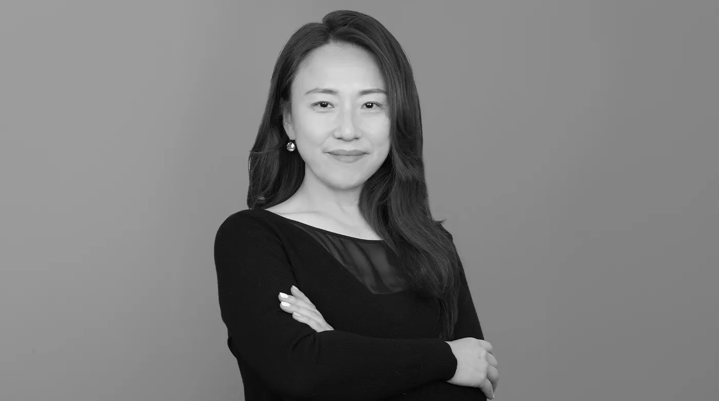
At the heart of this typographic-infused brand tour de force lies the DS Ddungsang Variable font, It’s not just a font; it’s a cool rebellion against the status quo, packaged in a sleek, versatile typeface. It’s the kind of font that doesn’t just push envelopes – it redesigns the entire postal system in the process (We still like to send physical mail).

It’s worth highlighting that the mastermind behind this typographic marvel is Yoon Design Group, which truly deserves the bulk of any credit being dispersed. Yoon Design Group is a high-end Korean typeface company that values history and tradition while pushing the boundaries of design. Yoon Design uses typography as a means to experimentally engage with diverse people and cultures, leading the way in promoting Korean culture on a global stage.

Yoon Design Group doesn’t just craft exclusive typefaces for global giants; they’re rewriting the language of branding itself, one meticulously researched, innovatively designed character at a time. We had so much fun playing around with their typefaces. So, we feel very comfortable giving them a massive salute and credit for their typographic masterpiece.
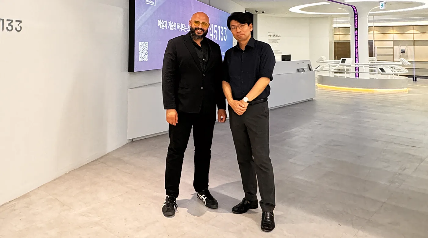


At the heart of KDIF’s design thinking is creating a conversation. KDIF isn’t just promoting Korean design; it’s redefining how we think about design branding itself. It’s a perfect fusion of past and future, local and global, form and function. The branding makes you sit up and take notice, piques your curiosity, and invites you to immerse yourself in the world of Korean design.
For Branding in Asia, KDIF represents more than just a series. It’s our way of saying, “Hey, design world, you might want to keep an eye on this corner of the globe.” We’re not just putting Korean design in focus; we’re adjusting the lens through which the global design community views Asian creativity as a whole.
And let’s not forget the ripple effect. This isn’t just about Korea or Asia. It’s about challenging the status quo in design branding worldwide. It’s about saying, “Who needs another helvetica-based wordmark when you can have a logo that’s practically a history lesson and a future forecast rolled into one?”
In essence, KDIF is our love letter to design – a testament to the power of thoughtful branding, and a challenge to the design world to keep pushing boundaries. It’s not just promoting Korean design; it’s elevating the entire conversation about what design can be.

To further immerse yourself in the world of Korean design, we invite you to integrate elements of KDIF’s visual language into your personal digital ecosystem. We’ve designed a collection of carefully crafted wallpapers that embody the essence of KDIF’s design philosophy.
Our offerings include high-resolution desktop backgrounds that transform your workspace into a canvas of contemporary Korean design. For mobile devices, we’ve designed a series of wallpapers that encapsulate the dynamic interplay between tradition and innovation characteristic of Korea’s design landscape.
Download here: Desktop Wallpapers / Mobile Wallpapers
Korean Design in Focus is designed by Station Design Bureau, in partnership with Branding in Asia.