Menu
What's up in Asia's Ad World
Menu


Landor & Fitch, as part of the brand refresh, examined all aspects of the brand – the overarching company mission and vision, the mindset of their customers, and where the company wanted to position the brand in the future.
The key insight was that in this digital-heavy post-pandemic landscape, several different career paths have emerged, as well as several different ways of working. The possibilities are now seemingly endless.
All of these studies led to the creation of the refreshed brand positioning, which was layered around the central brand idea of ‘Path to Possibilities’.
“It was crucial for us that the new identity not only retained some essence of the household Monster name, but also imbibed the new-age attributes the brand wanted to stand for.”
With this the brand was positioned as one where people can find something that suits them, be it a job, a course, or anything else that bolsters their professional repertoire.
“One of the many things that impressed us was that Monster.com didn’t just want to revamp into a new job portal but give it a new meaning, where consumers could explore different ways to enhance their knowledge, and that there are endless things they can do here beyond just finding a job,” said Ronita Mukerjee, Client Director at Landor & Fitch.
“This is where the idea of “path to possibilities” took form.”
Landor & Fitch also renamed Monster.com in APAC and ME in collaboration with Wunderman Thompson, wanting to capture the ultimate end goal of the job hunt journey.
“Found it” embodied that feeling of joy and contentment when seekers and recruiters find exactly what they’re looking for, making it an effortless brand recall. It encapsulated a sense of achievement, creating precise emotional impact.
Further building on the brand idea, Landor & Fitch created an aligned visual identity. Values such as empowerment, innovation, agility, and inspiration were used as bedrocks; all being refreshing characteristics for an employment brand.
With these, the aim for the design system was to be fresh, vibrant, and lively, aptly representing a platform that encourages exploration and perseverance.
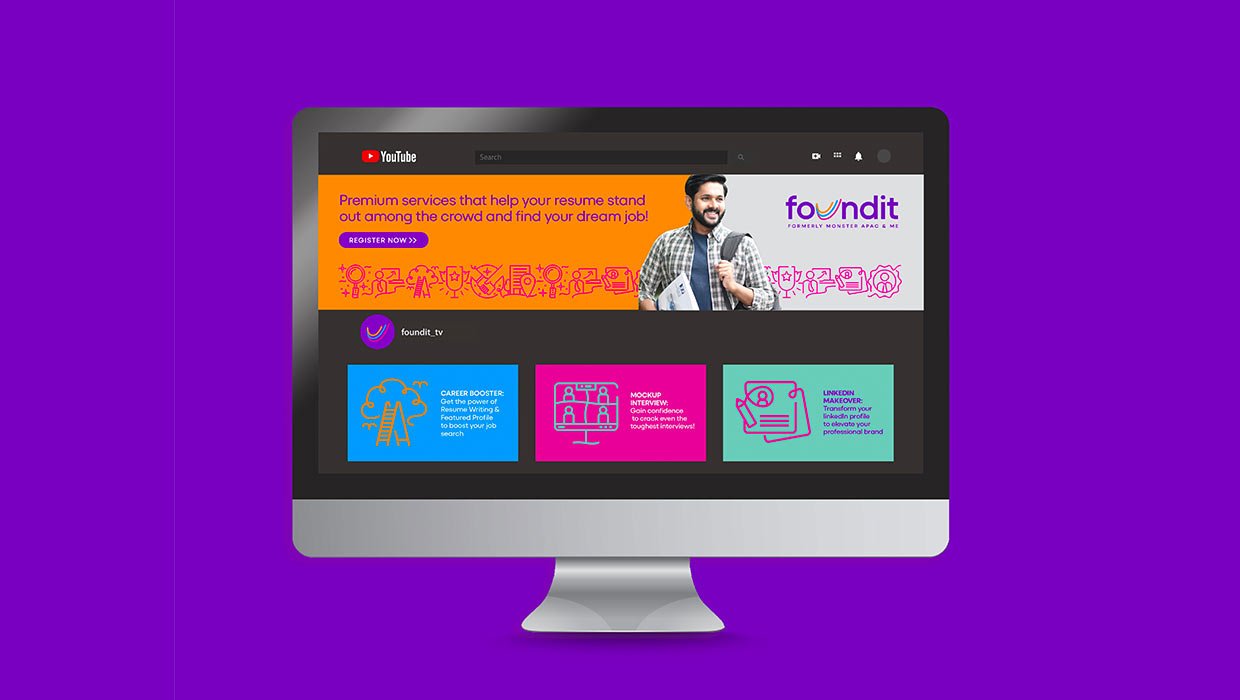
The foundit brand mark comprises strokes moving from one common starting point across different paths, while forming a ‘U’. Each stroke denotes a path to a new possibility, whereas the ‘U’ is representative quite unambiguously of ‘you’, keeping the people and their professional journeys at the forefront of the visual identity.
The color scheme, typefaces, and the interplay of bold colors and typography were all woven into a close-knit design system that suited digital adaptions well.

“The concept of ‘path to possibilities’ truly was an extension of a new age for Monster.com,” said Pavithra Dikshit, the Design Director who led the design at Landor & Fitch.
“While the idea was to refresh and make the new name and positioning relevant to today’s consumers, we decided to retain the iconic purple but make it digital first with a digital-friendly web color palette. The focus on ‘U’ paired with a friendly sans serif reflects the many different opportunities the brand and platform help make for every individual.”
When asked her thoughts on the refreshed brand strategy and design system and how it will help foundit, here’s what Tintu Saleem, foundit’s Brand & Strategy Director, said:
“It was crucial for us that the new identity not only retained some essence of the household Monster name, but also imbibed the new-age attributes the brand wanted to stand for.
“While the idea was to refresh and make the new name and positioning relevant to today’s consumers, we decided to retain the iconic purple but make it digital first with a digital-friendly web color palette.”
The new brand had to convey an evolved brand promise, and an elevated positioning catering to its core audience. Landor & Fitch got these nuances just right, and developed an identity that is more consumer-focused from multiple aspects, while standing out in the category. Kudos to the team for capturing the spirit of foundit just right!”